1.はじめに
今回は、Pythonを使って画像からグラフの近似式を読み取りたいと思います。先に断っておくのですが、画像からグラフの近似式を読み取りを完璧に行うのはほぼ不可能です。理由として、色や画質により画像の正確な読み込みには限界があることと、関数の種類がほぼ無限にあるからです。ですが、グラフからプロットを読み込んだり、グラフの形だけ真似たり、ある程度関数の形が分かっている状態で係数を求めたりなど、使える場面もあるので、目的に応じて使用していただければと思います。
2.画像の読み込み
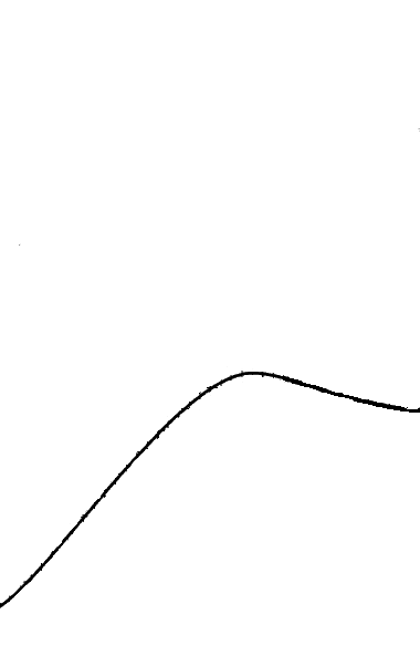
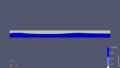
まず、近似式を読み取りたい画像をPythonで読み込みます。画像は下記のものを使用します。
読み込む画像の条件ですが
- 読み込みたいグラフと同じ色が目盛り、枠線、他のグラフ等に使われていない
- グラフの色をRGB値で正確に求められる
となります。理由は後ほど説明します。
画像を読み込むコードになります。
from PIL import Image

image = Image.open(r"読み込む画像の保存先")
image = image.transpose(Image.FLIP_TOP_BOTTOM)
画像を読み込んだ際に上下反転してしますので、FLIP_TOP_BOTTOMで反転しながら読み込んでいます。
3.画像を点群データに変換
読み込んだ画像を点群データに変換します。コードは下記のようになります。
import csv

width, height = image.size
target_color = (0, 0, 0)  # RGB値
coords = {}

x_min = 0
x_max = 4
y_min = 0
y_max = 3

for x in range(width):
    for y in range(height):
        pixel = image.getpixel((x, y))
        rgb = pixel[:3]
        if rgb == target_color:
            if x in coords:
                coords[x][0] += 1
                coords[x][1] += y
            else:
                coords[x] = [1, y]

# 平均値を計算
for x in coords:
    count = coords[x][0]
    total_y = coords[x][1]
    average_y = total_y / count
    coords[x] = (x_min + x*(x_max - x_min) / width, average_y * (y_max - y_min) / height)

# CSVファイルに座標を保存
with open('coords.csv', 'w', newline='') as csvfile:
    csvwriter = csv.writer(csvfile)
    csvwriter.writerow(['x', 'y'])
    for coord in coords.values():
        csvwriter.writerow(coord)
ポイント
- target_colorで読み込む色を指定(今回は黒なので(0,0,0))する。グラフ以外に同じ色を使っているとそれも読み取ってしまうので注意。
- x_min、x_max、y_min、y_maxは、読み込んだ画像のX方向とY方向の最大と最小を指定しています。読み込む画像の目盛りを参考にするといいと思います。
- 線の太さによってXの値が同一の点が複数抽出される場合があるので、「平均値」の計算でXの値ごとに平均をとり同一の点をなくしてる。
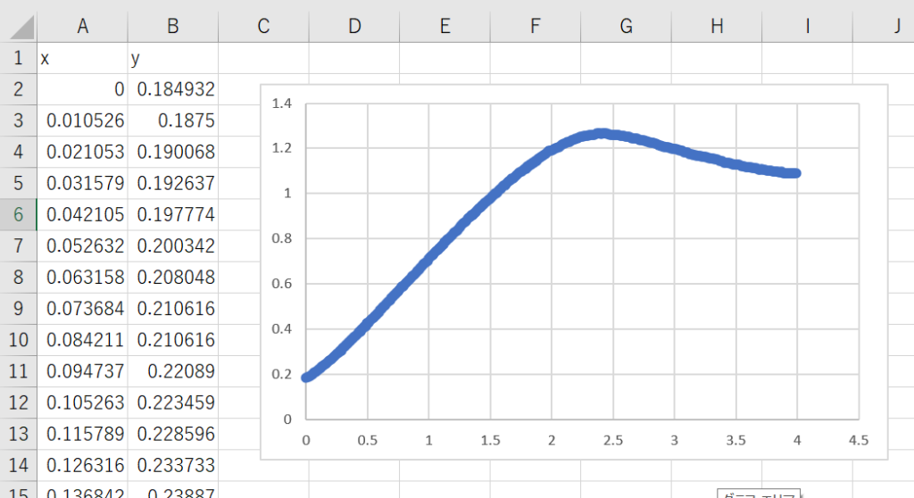
出力されたCSVと点群の散布図はは下記のようになります。
4.点群データを近似式へ変換
出力した点群データから近似式とグラフを出力します。コードは下記のようになります。
import numpy as np
import matplotlib.pyplot as plt
from scipy.optimize import curve_fit
from scipy import special

# 座標データをNumPy配列に変換
coords_array = np.array(list(coords.values()))

# 多項式
def func_poly_1(x, a, b):
    return a * x + b

def func_poly_2(x, a, b, c):
    return a * x ** 2 + b * x + c

def func_poly_3(x, a, b, c, d):
    return a * x ** 3 + b * x ** 2 + c * x + d

def func_poly_4(x, a, b, c, d, e):
    return a * x **4 + b * x ** 3 + c * x ** 2 + d * x + e

# 近似式のパラメータを最適化
popt_poly_1, _ = curve_fit(func_poly_1, coords_array[:, 0], coords_array[:, 1])
popt_poly_2, _ = curve_fit(func_poly_2, coords_array[:, 0], coords_array[:, 1])
popt_poly_3, _ = curve_fit(func_poly_3, coords_array[:, 0], coords_array[:, 1])
popt_poly_4, _ = curve_fit(func_poly_4, coords_array[:, 0], coords_array[:, 1])

# 近似直線のy座標の予測値を計算
y_pred_poly_1 = func_poly_1(coords_array[:, 0], *popt_poly_1)
y_pred_poly_2 = func_poly_2(coords_array[:, 0], *popt_poly_2)
y_pred_poly_3 = func_poly_3(coords_array[:, 0], *popt_poly_3)
y_pred_poly_4 = func_poly_4(coords_array[:, 0], *popt_poly_4)

# 近似式の表示
approximation_poly_1 = f"{popt_poly_1[0]:.5f} * x + {popt_poly_1[1]:.5f}"
print("一次式の近似:")
print(approximation_poly_1)

approximation_poly_2 = f"{popt_poly_2[0]:.5f} * x^2 + {popt_poly_2[1]:.5f} * x \
+ {popt_poly_2[2]:.5f}"
print("二次式の近似:")
print(approximation_poly_2)

approximation_poly_3 = f"{popt_poly_3[0]:.5f} * x^3 + {popt_poly_3[1]:.5f} * x^2 \
+ {popt_poly_3[2]:.5f} * x + {popt_poly_3[3]:.5f}"
print("三次式の近似:")
print(approximation_poly_3)

approximation_poly_4 = f"{popt_poly_4[0]:.5f} * x^4 + {popt_poly_4[1]:.5f} * x^3 \
+ {popt_poly_4[2]:.5f} * x^2 + {popt_poly_4[3]:.5f} * x + {popt_poly_4[4]:.5f}"
print("四次式の近似:")
print(approximation_poly_4)

# プロット
plt.scatter(coords_array[:, 0], coords_array[:, 1], label='Data')
plt.plot(coords_array[:, 0], y_pred_poly_1, color='orange', label='poly_1')
plt.plot(coords_array[:, 0], y_pred_poly_2, color='red', label='poly_2')
plt.plot(coords_array[:, 0], y_pred_poly_3, color='Cyan', label='poly_3')
plt.plot(coords_array[:, 0], y_pred_poly_4, color='magenta', label='poly_4')

plt.legend()
plt.xlabel('x')
plt.ylabel('y')
plt.xlim(0, 4)
plt.ylim(0, 1.5)
plt.show()
出力結果はこのようになります。
一次式の近似:
0.23739 * x + 0.46902
二次式の近似:
-0.14966 * x^2 + 0.83444 * x + 0.07307
三次式の近似:
-0.00864 * x^3 + -0.09797 * x^2 + 0.75208 * x + 0.10028
四次式の近似:
0.02920 * x^4 + -0.24160 * x^3 + 0.49897 * x^2 + 0.22448 * x + 0.20427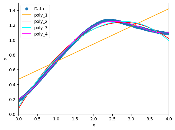
グラフを見ると4次式が一番近似してるように見えます。ですが、あくまで画像の範囲内のみかつ1~4次式の話です。画像外まで考慮した場合、まったく近似していなかったり、三角関数など別の関数を使ったほうがより良い近似式になる場合もあります。
5.バイアスとバリアンス
近似式のように、複数のデータから重心を求めるような計算に対して、その計算結果を評価するパラメータにバイアス (Bias:計算結果と真の値(元の数値)がどの程度ずれているかという指標)とバリアンス (Variance:予測のばらつき度合いを示す尺度)というモデルに対する評価指標があります。
バイアスが高いモデルは、モデルがデータの特徴を捉えられていないこと(過小適合)を意味します。
また、バリアンスが高いモデルは、既存のトレーニングデータに対しては再現性が良いですが、新しいデータ(テストデータ)に対してはうまく機能しないこと(過学習)を意味します。
バイアスが低すぎるとバリアンスが高くなりがちで、逆も同然ですので、理想的な機械学習モデルは、バイアスとバリアンスの良いバランスを取る必要があります。
6.おまけ
その他の関数
#三角関数
def func_sin(x, a, b, c, d):
    return a * np.sin(b * x + c) + d

def func_cos(x, a, b, c, d):
    return a * np.cos(b * x + c) + d

def func_tan(x, a, b, c, d):
    return a * np.tan(b * x + c) + d

# logistic関数
def logistic(x, L, a, b):
    return L / (1 + a * np.exp(-b * x))

# x*cdawson(x)
def func_xcdawson(x, a):
    return a * x * special.dawsn(x)
計算結果
sin関数を含む近似式:
-0.99 * sin(0.62 * x + 3.01) + 0.27

logistic関数による近似式:
1.20 / (1 + 6.28 * exp(-2.33 * x))

x*cdawson(x)による近似式:
1.91 * x * special.dawsn(x)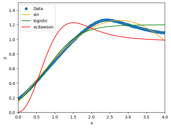
7.おわりに
今回は、画像からグラフを読み取って近似式にしてみました。近似式は使える場面が限られますが、画像から指定した色の座標を取得するコードはいろいろ応用できそうだと思います。のちのちGUIにしたいと思います。

コメント